Hello, when I build a sketch in SW 21-22, I am constantly forced to click on "sketch" then, for example, line, then "sketch" dimensioning, c then "sketch" circle, etc
I'd like, as in previous versions, to stay in the sketch submenu for as long as I need to. Did I make a wrong move that changed the menu structure? Is this a "normal" operation of this version?
Thank you in advance if you can enlighten me on this point.
Hello
I don't have SW21+ but if your sketch tab changes, eventually you should add a sketch taskbar, or use the floating bar that I personally make appear via the S key with what I use the most. (which avoids unnecessary travel, especially on the big screen) otherwise there is the radial menu.
Kind regards
Thank you for your two solutions. I've added the sketch taskbar.
So many evolutions since I started using SW in 1998!
You're welcome.
That doesn't prevent you from having a problem according to your words. Those who are in 2021 or more will be able to confirm this or not.
Hello
I am on SW 21 and I don't have this problem.
When I create a sketch and I go to the sketch menu, whatever I do circle, dimensioning line etc. It remains in the sub-menu sketch.
I searched in my options if I had any particular items checked or not to try to reproduce your problem and I found nothing (I can't reproduce your problem).
Kind regards
Thank you for your message. Last year, I was under the 2020-2021 version and I didn't have this problem. But I was able to do a trick that escaped me... I don't remember how the software behaves immediately after it is installed.
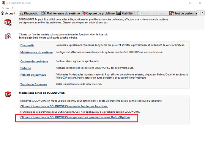
In Solidworks RX you can do a reboot with the restore settings as after an installation. The next restart of SW restores your settings.
This will allow you to see if it comes from your settings or not:
Otherwise to do it the old way:
A big thank you for this solution which works perfectly well (in SW RX).
Proof that at some point, I did something that shouldn't have been done!
Or a bug with the previous installation... Solidworks doesn't need us to bug 
Ps: remember to validate the solution. Thank you.
Right click - recent order - too, convenient so big screen, but there must be better...
